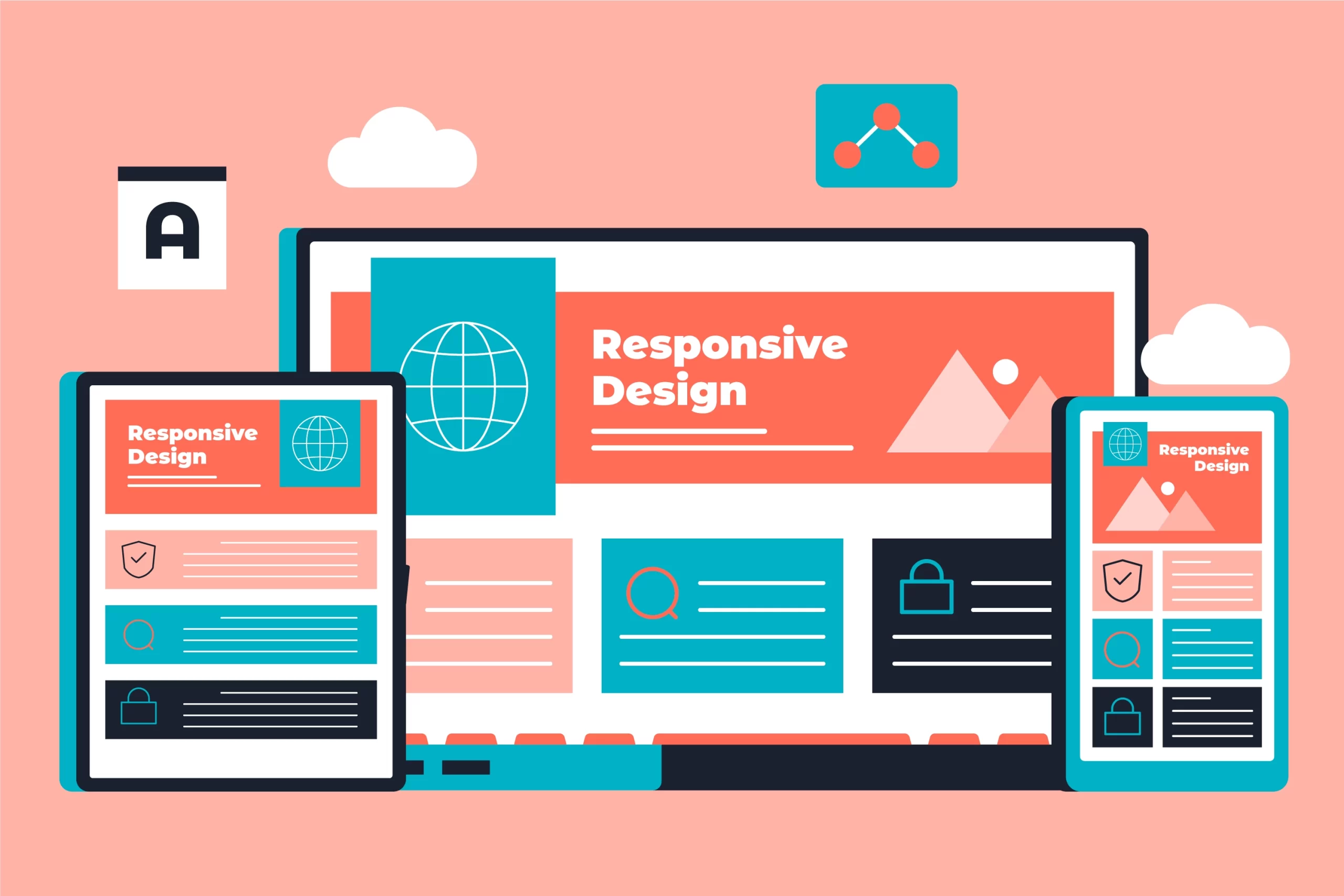
In today’s digital world, where mobile browsing surpasses desktop usage, having a website that adapts to any screen size is no longer a luxury, it’s a necessity. This is where Responsive Website Design (RWD) comes in.
Responsive Website Design Melbourne ensures your website seamlessly adjusts to desktops, tablets, and smartphones, delivering an optimal user experience for all visitors. But why exactly should RWD be your top priority? Here are five compelling reasons:
Enhanced User Experience (UX):
Imagine a potential customer trying to access your website on their phone. With a non-responsive design, they’d encounter text that’s too small to read, buttons that are impossible to click, and overall frustration. Responsive Website Design Melbourne ensures your website elements – text, images, and buttons – resize and rearrange automatically to fit any screen size. This creates a user-friendly experience that keeps visitors engaged and coming back for more.
Increased Mobile Traffic:
Did you know that over half of all web traffic now originates from mobile devices? If your website isn’t mobile-friendly, you’re essentially turning away a vast majority of potential customers. Responsive Website Design Melbourne ensures your website is optimized for mobile users, allowing you to capitalize on this ever-growing audience and maximize your reach.
Improved Search Engine Optimization (SEO):
Search engines like Google prioritize mobile-friendly websites in search results. A responsive website design signals to search engines that your website is user-friendly and accessible, potentially boosting your search ranking and driving more organic traffic. This translates to increased visibility and ultimately, more leads and conversions.
Consistent Brand Experience:
Maintaining a consistent brand experience across all platforms is crucial for building brand recognition and trust. Responsive Website Design Melbourne ensures your website design elements, like logos, colors, and fonts, adapt seamlessly to different screen sizes. This creates a unified brand image that resonates with visitors regardless of the device they use.
Cost-Effectiveness:
Gone are the days of needing separate websites for desktop and mobile users. Responsive Website Design Melbourne allows you to manage a single website that adapts to all devices. This translates to significant cost savings compared to maintaining two separate websites and dealing with the complexities of managing content across both.
Investing in Your Website’s Future
By prioritizing Responsive Website Design Melbourne, you’re investing in the future of your online presence. It ensures your website is accessible, user-friendly, and optimized for search engines, ultimately leading to increased brand awareness, customer engagement, and business growth.
For any inquiries, contact us on salesonsky@gmail.com and +61410624302. Share your thoughts in the comments section below.

