
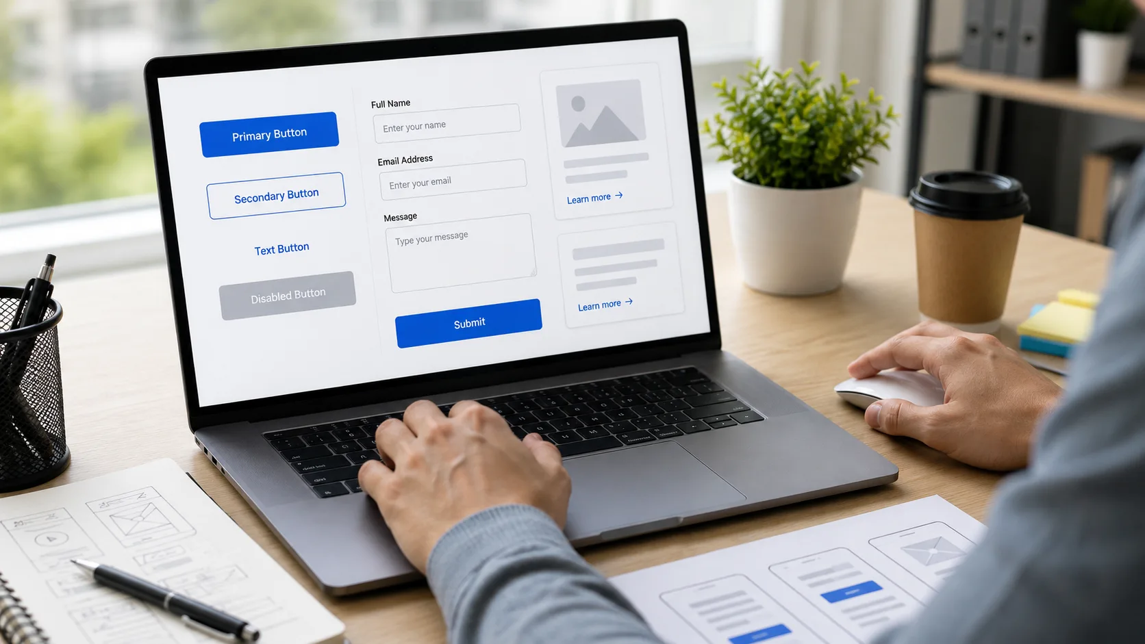
A visitor can understand your service perfectly and still leave without taking action. Sometimes the problem is not the offer. The button is unclear, the form asks for too much, or the link gives no clue about where it leads. Good UI UX Design Melbourne focuses on removing these small moments of hesitation before they become lost enquiries or abandoned tasks.
Buttons, forms, and links are the points where people interact with a website. Their design should make the next step obvious, predictable, and easy to complete. This matters for business websites, online stores, booking platforms, and applications alike.
What Does Better Usability Mean for Buttons, Forms, and Links?
Better usability means interactive elements clearly communicate what they do, are easy to identify and operate, and provide understandable feedback. Users should not have to guess whether something is clickable, what information a form requires, or where a link will take them.
The W3C’s WCAG 2.2 guidance also requires headings and labels to describe their topic or purpose and requires visible keyboard focus for keyboard-operable interfaces. These principles support clearer interactions for a wider range of users.
Make Buttons Clearly Communicate the Next Action
A button should tell users exactly what happens after they click it. Vague labels such as “Submit” or “Click Here” often provide less context than action-based wording.
A clear button might say:
- Get a Quote
- Book an Appointment
- Send My Enquiry
- Download the Guide
- Continue to Payment
The wording should match the user’s task and the outcome of the action. A “Get Started” button may work on a homepage, but a contact form often benefits from something more specific.
Keep Button Behaviour Predictable
Buttons should maintain consistent styles and behaviour across the website. Users should not have to relearn which colours, shapes, or interaction patterns represent important actions on every page.
For UI UX Design Melbourne, consistency is particularly important on larger websites where visitors move between service pages, forms, and conversion paths. Predictable patterns reduce hesitation and make the interface easier to understand.
Design Forms Around What Users Actually Need to Do
The best form is not necessarily the shortest form. It is the form that asks only for information genuinely required for the task.
Baymard Institute’s 2024 research found that the average checkout contained 11.3 form fields, while its research indicated that many checkout flows could work with around eight fields. It also reported that 17% of users had abandoned due to checkout complexity.
That lesson applies beyond e-commerce. Every unnecessary field adds effort.
Use a simple form structure
A practical form should:
- Ask only for necessary information.
- Use clear labels rather than relying only on placeholder text.
- Group related information logically.
- Mark optional fields clearly.
- Show useful error messages near the relevant field.
Single-column forms are often easier to follow because users can move through them in a clear sequence. Baymard’s usability research has found that multi-column form layouts can create confusion about the relationship and order of fields.
A real-world usability scenario
Consider a Melbourne business receiving website enquiries. Its contact form asks for a name, company, job title, phone number, budget, preferred service, project deadline, website URL, address, and several other details.
A visitor who only wants to ask a simple question may stop halfway. Reducing the initial form to the essential details can lower the effort required to start a conversation. Additional information can be collected later when it becomes relevant.
Write Links That Explain Where They Go
Links should provide useful context before users click. “Read more” can be acceptable when surrounding content makes the destination obvious, but descriptive links usually communicate more clearly.
Compare:
- Read more
- View our website redesign process
The second link sets a clear expectation.
W3C guidance on link purpose states that users should be able to identify a link’s purpose from the link text alone in applicable cases. This is especially useful for keyboard and assistive technology users navigating a page out of its visual context.
How Should Interactive Elements Work Together?
Buttons, forms, and links should form one clear user journey. A visitor should understand what to do next at each stage.
For example:
Service page → Learn about the service → View relevant information → Complete a short enquiry form → Receive clear confirmation
This is where collaboration between design and development matters. A Web Development Company Melbourne can build the functionality, but usability decisions should guide how that functionality is presented.
Good Web Development Company Melbourne work should therefore consider responsive behaviour, keyboard access, validation, loading states, and error recovery alongside visual appearance.
Common Mistakes to Avoid
Several usability problems repeatedly create unnecessary friction:
- Using generic button labels that hide the outcome
- Making forms longer than the task requires
- Using placeholder text as the only field label
- Hiding important links inside dense blocks of text
Another mistake is treating colour as the only way to show an error, required field, or button state. Clear text, labels, and visible feedback give users more reliable cues.
How Can You Improve Website Interactions?
Start with the pages where users are expected to take action. Review analytics, user feedback, form drop-offs, and common support questions where available.
Then check these areas:
- Can users identify the main action within seconds?
- Does every button explain what happens next?
- Does the form ask only for relevant information?
- Are errors easy to understand and correct?
- Can users tell where important links will take them?
Testing these interactions on mobile and desktop is essential. A form that appears simple on a large screen can become frustrating on a phone.
Frequently Asked Questions
Q: How should buttons be designed for better usability?
A: Buttons should use clear action-based labels, remain visually recognisable, and behave consistently. Users should understand what will happen before clicking and receive feedback after an action begins or completes.
Q: How many fields should a website form have?
A: A form should contain only the fields required to complete its purpose. Baymard’s research shows that unnecessary fields increase perceived effort, so businesses should review whether each requested detail is genuinely required.
Q: Should links say “click here”?
A: Descriptive link text is generally clearer because it explains the destination or purpose. Phrases such as “View pricing details” or “Read the accessibility guide” give users more context before they select the link.
Q: Why do users abandon website forms?
A: Users may abandon forms when they appear too long, confusing, invasive, or difficult to correct. Reducing unnecessary fields and providing clear labels and error messages can make completion easier.
Q: What is the difference between UI and UX in form design?
A: UI covers the visible elements, including fields, buttons, labels, spacing, and visual states. UX covers the wider task, including whether the form is logical, efficient, understandable, and easy to complete.
Conclusion
Better website usability comes down to three essentials: make actions obvious, reduce unnecessary effort, and give users clear feedback when they interact. Small improvements to buttons, forms, and links can remove friction at the exact moments when visitors are deciding whether to continue.
For businesses reviewing their website, UI UX Design Melbourne should focus on real user tasks rather than decoration alone. Sales On Sky can help assess how users move through key pages and where interface improvements may make important actions clearer. Submit an enquiry through the website form with details about your website and the usability issues you want to address, and start with a practical review of the user journey.