In today’s digital world, your website is your most crucial front door. People arrive from all sorts of devices – desktops, tablets, and smartphones. What experience do they find waiting? Do they encounter frustration or a seamless journey?
The truth is, if your website doesn’t adapt, you’re losing potential customers. Especially here in vibrant Melbourne, where people are always on the go, a responsive website isn’t just a nice-to-have; it’s essential. Happy users directly translate to more business. It’s a simple but powerful equation.
At Sales On Sky, we understand this deeply. We build responsive websites that put your users first, creating online experiences that delight visitors and drive tangible results for your Melbourne business. Visit us at https://salesonsky.com.au/ to see how we can help you achieve this.
Why User-Centric Matters in Web Design
Think about your own online habits. When you land on a website that’s clunky on your phone, requires constant pinching and zooming, or loads slowly, what do you do? You leave. Quickly. Your potential customers do the same.
A user-centric approach means designing and developing your website with your audience’s needs and behaviours at the forefront. It’s about creating an intuitive, enjoyable, and efficient experience, no matter how they access your site.
Responsive Design: The Cornerstone of User Happiness
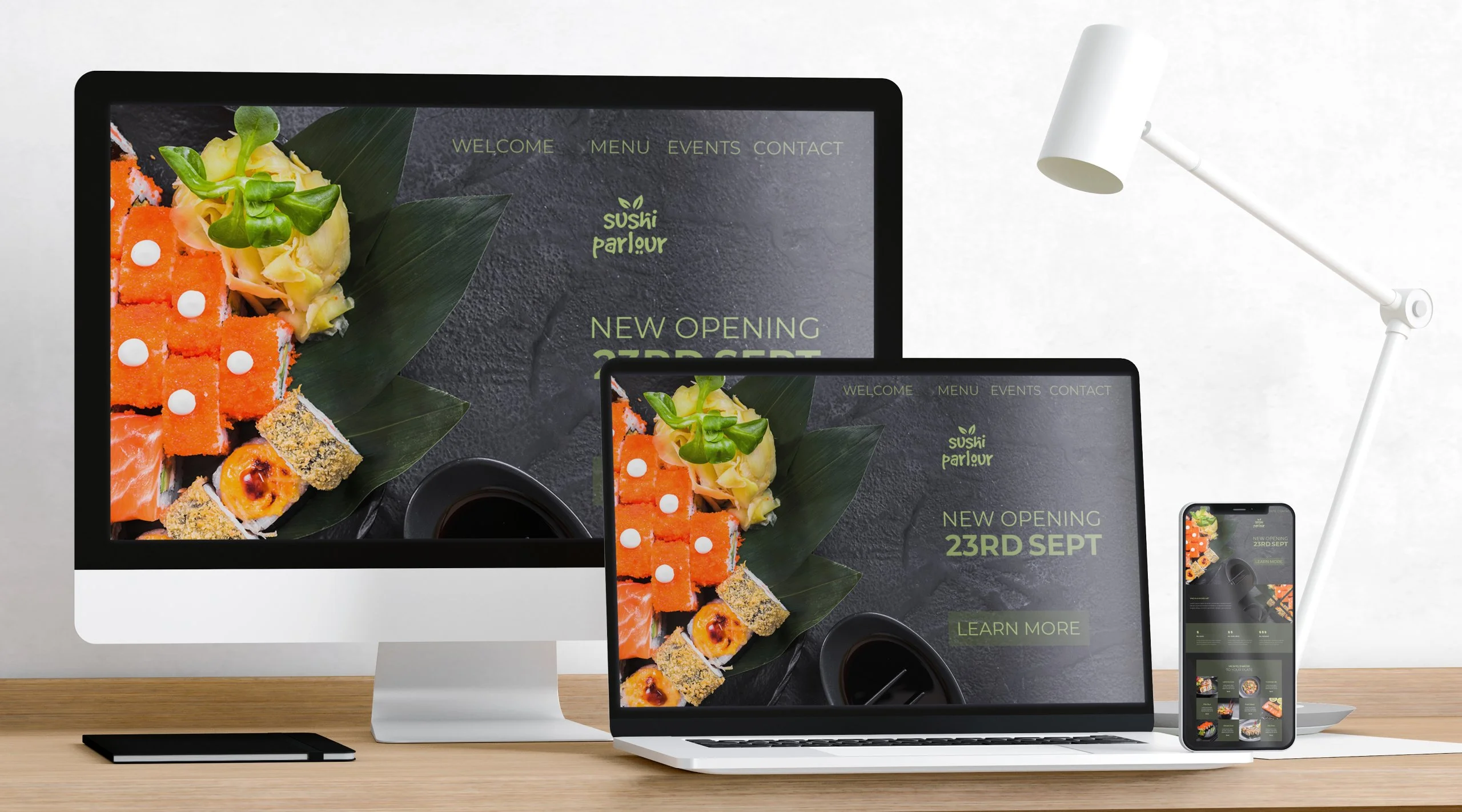
Responsive web design is the key to this user-centric approach in a multi-device world. It’s a technique that ensures your website fluidly adjusts its layout, images, and content to fit any screen size and resolution. No more separate mobile sites or compromised experiences. One website, many devices, one consistently excellent impression.
For Melbourne businesses, this is critical. Locals and visitors alike are using their phones to find cafes, book services, or shop online. If your site doesn’t work perfectly on their device, they’ll find a competitor whose does.
Seamless Experience, Reduced Frustration
Imagine someone in Fitzroy searching for your business on their tablet. With a responsive website, the navigation is clear, the text is readable, and the buttons are easy to tap. They find the information they need effortlessly. This seamless experience builds trust and keeps them engaged.
Conversely, a non-responsive site forces them to struggle. They get frustrated. They leave. You lose a potential customer simply because your website didn’t cater to their device.
Faster Loading Speeds, Happier Visitors
Website speed is paramount for user happiness. People expect pages to load almost instantly. Responsive design often incorporates optimisations that ensure faster loading times across all devices, especially on mobile networks which can be slower.
A fast-loading, responsive site keeps visitors on your page longer, giving you more opportunity to convert them into customers. In the fast-paced Melbourne market, every second counts.
Improved SEO and Higher Visibility
Search engines like Google heavily favour mobile-friendly websites. A responsive website is a key factor in your search engine ranking. When your site offers a great experience on all devices, Google rewards you with higher visibility in search results.
This means more people searching for businesses like yours in Melbourne are likely to find you. Increased visibility directly leads to more organic traffic and, you guessed it, more potential business.
One Website, Easier Management
Maintaining separate websites for desktop and mobile is a headache. It costs more time, money, and resources. With a responsive website, you have one single site to manage. Updates, content changes, and maintenance become significantly simpler and more efficient.
This streamlined management allows you to focus on what matters most: running your Melbourne business and serving your customers.
Increased Conversions, Measurable Growth
The ultimate goal of any business website is to drive conversions – whether it’s a sale, a lead, or a contact request. A responsive, user-friendly website removes barriers in the conversion path.
When your site is easy to navigate, loads quickly, and looks great on any device, users are more likely to complete the desired action. This directly impacts your bottom line and fuels business growth. Happy users who find what they need quickly are far more likely to become paying customers.
Why Sales On Sky for Your Responsive Melbourne Website?
At Sales On Sky, we don’t just build websites; we craft digital experiences focused on your users and your business goals. We understand the unique landscape of the Melbourne market and design responsive websites that resonate with your target audience.
Our team uses the latest technologies and best practices to ensure your website is not only responsive and visually appealing but also optimised for performance and search engines. We work closely with you to understand your business and create a website that serves as a powerful engine for growth.
We believe in the power of a user-obsessed mindset. Your success is our success, and we are committed to building websites that make your users happy and your business thrive. Explore our services at https://salesonsky.com.au/ and let’s discuss how a responsive website can transform your online presence.
Frequently Asked Questions About Responsive Website Design
Here are some common questions people ask about responsive website design:
1. What exactly is responsive website design?
It’s a design approach where your website’s layout and content automatically adjust to fit the screen size of any device, from desktops to smartphones.
2. Why is responsive design important for my Melbourne business?
Most people in Melbourne use mobile devices to browse the web. A responsive site ensures they have a great experience, improving engagement, reducing frustration, and increasing your chances of gaining them as a customer.
3. How does responsive design help with SEO?
Search engines like Google prefer mobile-friendly websites. A responsive site is a key ranking factor, improving your visibility in search results and driving more organic traffic.
4. Is responsive design expensive?
While the initial investment might be comparable to or slightly more than a non-responsive site, it saves you money in the long run by eliminating the need for separate mobile websites and simplifying maintenance.
5. How can Sales On Sky help me get a responsive website?
Sales On Sky specialises in creating user-centric, responsive websites tailored for the Melbourne market. We handle the design and development process, ensuring your site looks great and performs flawlessly on all devices, helping you attract more customers and grow your business. Visit https://salesonsky.com.au/ to learn more.
Conclusion: Invest in User Happiness, Reap Business Rewards
In today’s competitive digital landscape, a responsive website is non-negotiable for any Melbourne business serious about growth. Prioritise your users’ experience, and they will reward you with their business.
Don’t let an outdated or non-responsive website hold you back. Embrace the user-centric power of responsive design and watch your business flourish. Contact Sales On Sky at https://salesonsky.com.au/ today and take the first step towards a website that makes users happy and drives remarkable business results.

