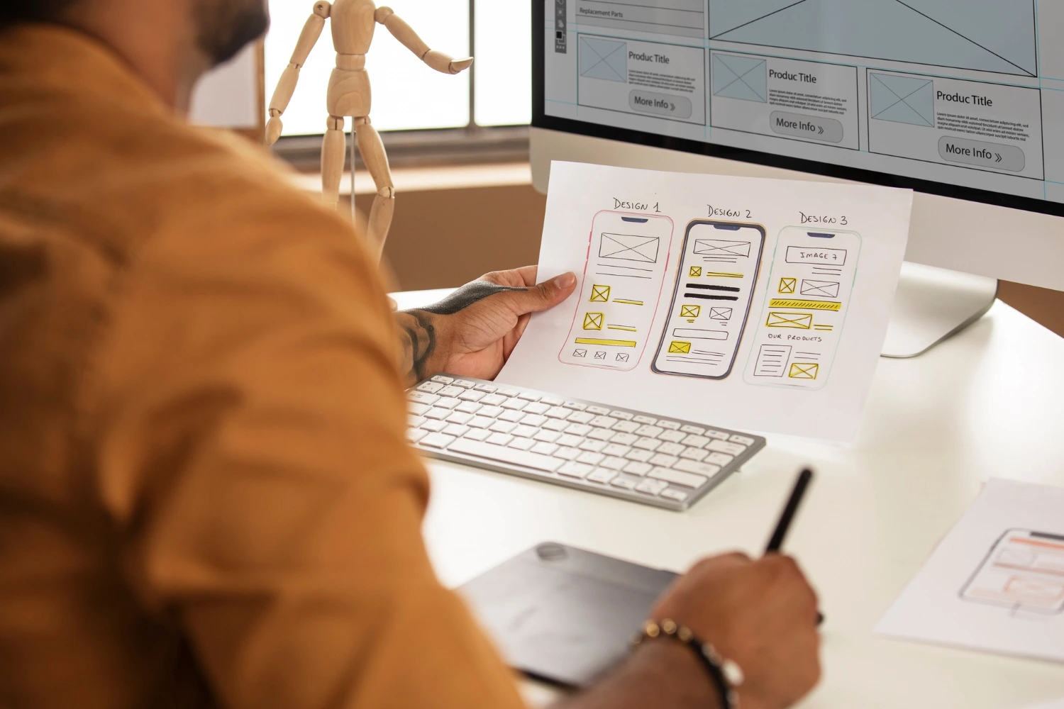
Bad UX Design Cripples E-commerce Sales
Bad UX design cripples e-commerce sales by increasing friction, eroding trust, and driving potential customers to competitors with smoother, faster interfaces. Over 70% of online shoppers admit they would abandon a site entirely due to slow load times or poor mobile navigation. This is a critical factor for any business engaged in E-commerce website development Melbourne seeking to succeed in a competitive digital landscape. A poor user experience directly translates to a lower conversion rate and a higher bounce rate, regardless of the quality of your products or the size of your marketing budget.
What is the Direct Impact of Poor Navigation on Conversion Rates?
Poor navigation confuses the user, forcing them to spend more cognitive effort finding what they need, directly leading to high cart abandonment rates. Studies indicate that a complex checkout process is the single biggest cause of abandoned carts, accounting for over 18% of all lost sales.
The customer journey should be intuitive. If a user cannot find the search bar, filter products efficiently, or understand how to return to a category page, they will leave. For example, sites that bury their shipping and returns policy force users to hunt for critical information, introducing unnecessary doubt and friction right before the purchase decision.
Key Navigation Best Practices:
- Consistent Placement: Place core elements like the cart, search bar, and main menu in expected locations (top right, top center).
- Clear Labeling: Use unambiguous terms like “Shop,” “Categories,” “Checkout,” and “My Account.” Avoid internal jargon.
- Effective Filtering: Implement faceted navigation that allows users to filter by size, color, price, and customer rating without a page reload (using AJAX). This vastly improves speed and efficiency.
How Does Site Speed Relate to Customer Trust and Conversions?
Site speed is directly correlated with customer trust and conversions; slow loading times signal an unprofessional or poorly maintained site, causing users to abandon it before they even begin to browse. Data from leading search engines confirms that a two-second delay in page load time can result in abandonment rates as high as 87%—a stark increase from the 38% for pages loading in just one second.
Why is Mobile Optimization No Longer Optional?
Mobile optimization is crucial because a majority of modern web traffic and e-commerce transactions now occur on smartphones, and a non-responsive design creates a fractured, unusable experience for the largest segment of your audience. If your site’s elements—buttons, text, and images—do not automatically scale and adjust to different screen sizes, the user has to pinch and zoom, leading to frustration and immediate exit.
When Sales On Sky works with clients, we prioritize a “mobile-first” approach. This means the entire design and development process begins with the smallest screen, ensuring a seamless experience that scales up to desktops, rather than the other way around. This process naturally addresses the ‘crawl budget’ concern, as search engines favor sites that are easily indexed across devices.
Technical UX Elements That Must Be Optimized for Speed:
- Image Compression: Use modern formats (like WebP) and implement lazy loading so images only load as the user scrolls down the page.
- Minification: Reduce HTML, CSS, and JavaScript file sizes by removing unnecessary characters and whitespace.
- Server Response Time (TTFB): Optimize server performance and use a Content Delivery Network (CDN) to distribute your site’s content closer to the user’s geographical location, minimizing latency.
What Constitutes a “High-Friction” Checkout Process?
A high-friction checkout process is one that forces the user to complete too many steps, input repetitive information, or create a mandatory account before completing their purchase, leading to inevitable cart abandonment. Research by the Baymard Institute shows the average large e-commerce site can recover an estimated $260 billion in lost orders by simply improving the checkout flow.
How Can Simplifying the Checkout Process Boost Sales?
Simplifying the checkout process minimizes the steps between the cart and the final purchase, lowering the user’s cognitive load and reducing the opportunities for distraction or doubt.
Essential Checkout Flow Improvements:
- Guest Checkout: Always allow users to purchase as a guest. Make account creation optional and present it after the purchase is complete.
- Progress Indicator: Use a clear visual indicator (e.g., “Step 1 of 3: Shipping Step 2 of 3: Payment Step 3 of 3: Review”) so users know exactly where they are and how many steps remain.
- Form Auto-fill: Use browser and operating system native auto-fill functionality for address and payment details.
- Inline Validation: Provide instant feedback on form fields (e.g., green checkmark for a valid email format) to reduce user errors and frustration.
This focus on simplicity is crucial for any successful E-commerce website development Melbourne project, as it directly addresses a critical point of leakage in the sales funnel. We often advise clients to eliminate any pop-ups or distractions during this phase, ensuring a smooth path to conversion.
The Role of Search Intent in UX
Understanding a user’s ‘search intent’—their goal when they type a query—is paramount to good UX. If a user is searching for a product review, they have a different need than a user searching to buy that product. Good UX design anticipates these different intentions. For instance, a user with commercial intent should be directed straight to a product page with clear ‘Add to Cart’ buttons, while a user with informational intent should be served a detailed blog post or guide. This ensures every page provides immediate, relevant value.
Glossary of Essential UX Terms for E-commerce
- Bounce Rate: The percentage of visitors who leave a website after viewing only one page. A high bounce rate is a strong indicator of poor UX.
- Canonical Tags: A line of code that tells search engines which page is the preferred (canonical) version among a set of duplicate pages. This helps manage ‘on-page signals’.
- Friction: Any element in the user journey that creates resistance, uncertainty, or extra work, slowing down the path to conversion.
- Search Intent: The underlying reason why a user has performed a specific search query (e.g., informational, navigational, commercial, transactional).
Conclusion
The success of your e-commerce venture is inextricably linked to the quality of your User Experience. A poorly designed site, regardless of how robust the underlying technology is, will alienate customers and suppress sales. By prioritizing speed, simplifying navigation, enabling effective mobile responsiveness, and creating a low-friction checkout, businesses can significantly improve their conversion rates and build lasting customer trust. Investing in a strategic, user-centric design approach is not merely an expense; it is the most crucial investment a modern e-commerce business can make.
Frequently Asked Questions (FAQ)
- 1. What is the ideal page load time for an e-commerce website?
The ideal page load time is under three seconds, but industry leaders strive for under two seconds for the “First Contentful Paint” (when the user sees the primary content). Every second of delay beyond that point dramatically increases the likelihood of a visitor leaving the site and lowering sales. - 2. How often should I test the user experience of my e-commerce site?
You should conduct A/B testing and user testing continuously, ideally setting a quarterly review cycle to analyze heatmaps, session recordings, and conversion funnel drop-offs. User behavior changes over time, and regular testing is the only way to catch new areas of friction. - 3. Does poor UX affect my site’s visibility in search results?
Yes, absolutely. Search engines use user behavior metrics like time on site, bounce rate, and click-through rate as ‘on-page signals’ to determine content quality and relevance. A site with a poor UX will have negative signals, which can lead to lower rankings. - 4. What is the most critical element to review on my product pages?
The most critical element is the clarity and placement of the “Add to Cart” button. It must be highly visible, clearly labeled, and load instantly above the fold on all devices, as this is the primary conversion call-to-action (CTA). - 5. What are the signs I need to overhaul my website’s UX?
Clear signs include a high bounce rate on key landing pages, a cart abandonment rate above the industry average (around 70%), and low ‘time on page’ statistics. If customer service frequently receives complaints about site functionality, a full UX audit is necessary.


